Inkipedia talk:Logo Contest 2022/Round 3: Difference between revisions
m (logo voting (14)) |
m (logo voting (15, for real this time)) |
||
| Line 116: | Line 116: | ||
* '''Strong Support.''' I love the animation you used for the drawing. It is really cool that you added an octoling too, as they are also a big part of the game. I really like the font on it, and how it is similar to the in-game font, but still different. Very cute and very fresh! [[User:AgentVeemo|AgentVeemo]] ([[User talk:AgentVeemo|talk]]) 09:52, 18 July 2022 (UTC) | * '''Strong Support.''' I love the animation you used for the drawing. It is really cool that you added an octoling too, as they are also a big part of the game. I really like the font on it, and how it is similar to the in-game font, but still different. Very cute and very fresh! [[User:AgentVeemo|AgentVeemo]] ([[User talk:AgentVeemo|talk]]) 09:52, 18 July 2022 (UTC) | ||
* '''Oppose''' I don’t want to sound mean or anything, but this logo wasn’t my favorite at all. the squid and octopus were too small compared to the ink trails and the words were to small compared to the background. Also the yellow background doesn’t quite fit with the splatoon 3 color scheme. If you made everything a bit bigger and made one side of the text purple and one side splatoon 3 yellow it would look better. But still good job on making it so far. [[User:Octohachi|Octohachi]] ([[User talk:Octohachi|talk]]) 13:20, 18 July 2022 (UTC) | * '''Oppose''' I don’t want to sound mean or anything, but this logo wasn’t my favorite at all. the squid and octopus were too small compared to the ink trails and the words were to small compared to the background. Also the yellow background doesn’t quite fit with the splatoon 3 color scheme. If you made everything a bit bigger and made one side of the text purple and one side splatoon 3 yellow it would look better. But still good job on making it so far. [[User:Octohachi|Octohachi]] ([[User talk:Octohachi|talk]]) 13:20, 18 July 2022 (UTC) | ||
* '''Support''' Cute, Splatoony, great concept and good execution. I like the background of the wordmark being colored instead of the wordmark itself. My only real problem is the lack of visible tentacles on the squid and octopus (which is really just me being nitpicky). I have this mental image of this logo being flipped around like a coin before screwing down into a round hole where the logo should be, and it's great. <span style="font-family:Splatoon">[[User:Avery the Squid Phoenix|<span style="color:purple">Avery_TSP</span>]] ([[User talk:Avery the Squid Phoenix|<span style="color:blue">conversing</span>]])</span> 16:59, 18 July 2022 (UTC) | |||
== General discussion == | == General discussion == | ||
* | * | ||
Revision as of 16:59, 18 July 2022
In a nutshell, Round 3 is this: Your words are your vote. Leave comments under each logo proposal about what you like or dislike, and what makes each logo a good fit or bad fit for Inkipedia. Through discussion and argument, determine the best logo. For more information, read the full guidelines.
The Inkipedia logo from 2015 is part of Round 3 and may be discussed in the same manner as the others. Continuing to use the logo is a valid outcome of Round 3.
A Round 2 link is provided for each logo, so that you can see the mockups, icons, and wordmarks.
To reply to someone else, press [edit] and insert :* Your reply ~~~~ in the line below the comment you are replying to, using more colons for more indenting as appropriate.
Logo 2015
Logo 2015 discussion
- Oppose Have to be honest, after seeing everyone's entries over the past week or so, I think I'm more than comfortable to let this one go. It has seen its hayday. -- PanchamBro (talk • contributions) 15:53, 17 July 2022 (UTC)
- Oppose. For all the reasons laid out that led to us having this vote, I am more than happy to replace the logo with one of the new submissions. It was nice, but originality is the spice of life! GloverMist (talk) 21:59, 17 July 2022 (UTC)
- Weak Support I got to say that back when I first heard about this contest, I didn't really get why the current logo had to be substituted. If it was up to me, we would either keep it or use a logo similar to it. Cosmo95 (talk) 22:04, 17 July 2022 (UTC)
- Oppose Even though I am one of the competitors of this contest, I have to say I don't mind the og logo all too much. It is definetly incredibly dated by both logo design standards, and specially when it comes to the franchise itself. Besides using an old squid design, it features the color schemes and design style of the first game, but I still think it has become a part of the site's identity. Though, I think the new proposals can bring a much more interesting appearance to the wiki as a whole, so I think it's good to let it go ninckmane (talk) 22:14, 17 July 2022 (UTC)
- Weak Oppose Although the current logo isn’t that bad, I can definitely see that the other logo proposals are a much better improvement than this. OrderSquid38 (talk) 23:43, 17 July 2022 (UTC)
- Oppose I loved this logo but yes, it has had it's time and a new fresher logo should be put up! I'd rather have a new logo because why else would this vote matter!!--Oddlildude (talk) 01:58, 18 July 2022 (UTC)
- Oppose Even though it looks nice, I think it is a little bland and it is time for an original logo and wordmark. Lazyfish (talk) 11:11, 18 July 2022 (UTC)
- Oppose As much as I enjoyed the Octo expansion, retro stuff isn’t that cool anymore. We need a new community representative. This one was on for a good 7 years, and there is no reason to keep it. It’s bland, uncool, and has no variations in color scheme. (Sorry to whoever made this)Octohachi (talk) 13:53, 18 July 2022 (UTC)
- Oppose This logo is okay, but we can do better. I don't dislike it per se, but all that green in the logo combined with all the green we already have in the site's palate gets old pretty fast. Avery_TSP (conversing) 16:36, 18 July 2022 (UTC)
Proposal 7
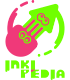
- Proposal 7 (P7) by ninckmane
- Round 1 link: Inkipedia:Logo Contest 2022/Round 1#Proposal 3
- Round 2 link: Inkipedia:Logo Contest 2022/Round 2#Proposal 7
Proposal 7 discussion
- Weak Support. I like the overall design, but the wordmark looks strange being cut off. I understand if it couldn’t fit the whole thing. OrderSquid38 (talk) 13:43, 17 July 2022 (UTC)
- Strongest support: I gotta say, your design, of all designs, is the most aesthetically appealing one, though the wordmark might need some tweaks. Minimalism is usually something that the creative fans of the fandom frown upon. But you have proven them that experimenting with minimalism is not a taboo, and shown us how it can truly be done the right way. And while I think that other designs look decent and "fresh" enough, with actual efforts put into them, I still want to give your work a chance. I'll give you the largest support because you deserve it. Walk tall, our brave little squiddy. Squiddies of the World, Unite! 🦑️ Ika-Katsumi 🐙️ File:S2 Icon Callie 2.png talk File:S2 Icon Marie 2.png contributions 14:03, 17 July 2022 (UTC)
- Strongest support: This has been my favorite out of all the designs so far; it’s modern, clean, and I like the fact that it’s able to be changed color-wise. I think it really looks good! HalfSanitized (talk) 14:10, 17 July 2022 (UTC)
- Support Even though this logo has been overshadowed with some of the logo in this list, I think this logo does balance the minimalism and uniqueness well. I do wish the watermark without the logo was in one word however. -- PanchamBro (talk • contributions) 15:53, 17 July 2022 (UTC)
- Oppose I think that this logo is oversimplified and the cut-off wordmark makes it a little weird. I've seen better, but congrats on making it this far. User:DedSplat1369/Sig 21:10, 17 July 2022 (UTC)
- Weak support. I’m usually against minimalism, and still think that more detailed designs are more aesthetically pleasing, but this works surprisingly well! I like how the colours can be changed easily and the squid/octo representation is nice, but there’s something about the eyes I don’t quite like. Plus, as others have said, the split wordmark strikes me as odd and hard to read. But overall, still nice and smooth. GloverMist (talk) 21:59, 17 July 2022 (UTC)
- Quick note Hey! I'm the creator of the logo. As for the cut off logo, as some of you have mentioned, I did it with the intention of making it more even-sized with the icon, so it doesn't become as much of a pain to read on smaller displays and all of that, and also to give some kind of movement to the wordmark. Of course, it could be changed, and originally it was all in one line (if you check the original design on Round 1), so we'll see! ninckmane (talk) 22:31, 17 July 2022 (UTC)
- Strongest Ever Support I loved this logo. As a big fan of the octos, I like how this logo design gives them their rightful place next to the squids. The interlocking tentacles makes it seem like they belong together, and the color changes make it perfect for all 3 games. Overall awesome job ninckmane. Octohachi (talk) 14:01, 18 July 2022 (UTC)
- Strong oppose I don't really like this logo. The colors are just... off, the shape of the octo head is weird, and I don't think the style captures the feel of the Splatoon series in the right way. The eyes also aren't very appealing and don't stand out enough. The wordmark isn't my favorite either; the split is confusing (the site is Inkipedia not Inki Pedia), the font really takes away from the readability for me, and the little ink drips are cute but distracting. It would be a decent logo for perhaps a modern-style, super streamlined competitive site, but I don't feel that it fits Inkipedia in the ways I want with the new logo. Avery_TSP (conversing) 16:45, 18 July 2022 (UTC)
Proposal 8
- Proposal 8 (P8) by Skua
- Round 1 link: Inkipedia:Logo Contest 2022/Round 1#Proposal 14
- Round 2 link: Inkipedia:Logo Contest 2022/Round 2#Proposal 8
Proposal 8 discussion
- Strong Support.My favorite one so far. This is absolutely amazing, even if it isn’t that different from the old logo. It fits really well with the ink splatters, and overall this is a perfect logo for Inkipedia. OrderSquid38 (talk) 11:20, 17 July 2022 (UTC)
- Strong Support. It is neither too much nor too simplified. This proposal shows that you can be creative without overdoing it. The squid logo has been given a nice colorful addition, and the way "Inkipedia" is written in the same font as the games themselves complements it very well. Skua has outdone themself and created a logo that feels like it was officially made by Nintendo. And due to it being so faithful looking, it gets the Perfectionist-Approval, which isn't worth more than a normal vote, but it's still very rare.
Perfectionist (talk) 12:19, 17 July 2022 (UTC) - Oppose. I don't really have a clue as to how this one slipped into the final round, but criticize I must... Okay, firstly, the wordmark is just...not appealing. I don't know how to describe it, but it certainly doesn't fit with the icon at all, and having a very curved wordmark like that doesn't look great on other skins/devices due to the added vertical height and it not being anchored to a 90° angle on the site. As for the icon, it makes me a little uncomfortable. The eyes though. The EYES. Not only do they not line up with the squid's torso, but they're literally ripped straight from the Splatoon logo.
- Overall, while objectively clean, this logo feels generic, a little uncreative and nothing about it really has that 'wiki' kinda look and feel, and the lack of any defined angles and correlation between the logo and wordmark makes it look floaty and out of place. User:Cynical Prince/Sig 13:32, 17 July 2022 (UTC)
- Weak Support Have to agree with Princewave in regards to the wordmark and all, but I think the logo isn't out of place with how certain other wikis put it, say Super Mario Wiki with its mushroom-shaped logo. I'm very happy though that you managed to fix several issues from your first iteration. -- PanchamBro (talk • contributions) 15:53, 17 July 2022 (UTC)
- Weak Support I liked the OG one better. Simple and official. But this one, while still official, looks a bit...off. Not sure how to describe it fully, but the eyes of the squid look out of place and at the wrong angle. Congrats Skua, and keep designing. User:DedSplat1369/Sig 21:26, 17 July 2022 (UTC)
- Oppose I hope I won't sound too harsh, but I don't really like this logo to be honest. The color palette isn't great in my opinion, the position of the eyes bothers me a bit and, while I appreciate that it kept the Splatoon aesthetic and used the title font, it also feels a bit generic to me. — Preceding unsigned comment added by Cosmo95 (talk • contribs) 21:56, 17 July 2022 (UTC)
- Oppose. Sadly, although the wordmark is beautiful and I would be more than happy to have that as a thing any day, the logo itself strikes me as uninspired and no real improvement over the current one. Yes, it’s more colourful, but it’s also based directly on Nintendo assets, which we’re explicitly trying to avoid. And, yeah - those eyes. Sorry! GloverMist (talk) 21:59, 17 July 2022 (UTC)
- Strong Support I really like this logo and how it fits the splatoon theme. The color scheme if cool and makes it pop really well. I kind of wish it was an octopus though...Octohachi (talk) 13:08, 18 July 2022 (UTC)
- Strong support This is my favorite logo out of the bunch. While I agree that the eyes could be better aligned, the logo captures the Splatoon feel perfectly. I love the originality of having the squid with ink splotches inside of it instead of a squid with ink in the background. Plus, the wordmark looks just like the real thing and I love that. It's simple, clean, fits the series perfectly, and I very much hope this one gets the top spot. Avery_TSP (conversing) 16:49, 18 July 2022 (UTC)
Proposal 13
- Proposal 13 (P13) by Princewave
- Round 1 link: Inkipedia:Logo Contest 2022/Round 1#Proposal 11
- Round 2 link: Inkipedia:Logo Contest 2022/Round 2#Proposal 13
Proposal 13 discussion
- Weak Support. I like the gold and blue in this, but it doesn’t fit well with the Splatoon colors. I like the concept but I’m just a bit concerned about the aesthetic. OrderSquid38 (talk) 13:51, 17 July 2022 (UTC)
- Strong Support. I love that this logo is not bent toward to a specific game in the Splatoon series. I love the creativity in this and how it is nowhere near the original logo. I really enjoy that on the example page, the Inkipedia theme is set to blue. Thank you for this proposal. AlphaMale300 (talk)
- Support: The first version of the logo looks clean and sleek, very organized, and represents Inkipedia well. I also love how it’s based on the sunken scrolls! HalfSanitized (talk) 14:13, 17 July 2022 (UTC)
- Strong Support The 1920s charm of this logo is beautiful in its own way, and in comparison to the other logos here I feel this one has the most creative idea presented for Inkipedia's logo. -- PanchamBro (talk • contributions) 15:53, 17 July 2022 (UTC)
- Strong Support. It looks very eye-catching with its font and picture reminding me of a card game, yet subtle enough to let a person still be able to focus on the page itself. Also, I agree with HalfSanitized: The sunken scroll design is a nice touch. Chaos Agent (talk) 17:28, 17 July 2022 (UTC)
- Strong Support Creative idea, original design, and a clean, polished look gives this absolute masterpiece my vote. I can definitely see how this tied for first. Great job Princewave, and keep making art.User:DedSplat1369/Sig 21:27, 17 July 2022 (UTC)
- Strong support. By far my favourite of the nominees! This is incredibly clean, incredibly original, and incredibly stylishly put together. I much prefer the first design to the second for the colour scheme, but both work well. This is the kind of thing that fits the bill as a professionally-made wiki logo perfectly and the one I would be most happy to use on the site. GloverMist (talk) 21:59, 17 July 2022 (UTC)
- Neutral I quite like how this logo made a sunken scroll encyclopedia and a squid bookmark. I have a preference towards logo that are more heavily inspired by the game's aesthetic, but I wouldn't mind having this one as a logo. Cosmo95 (talk) 22:02, 17 July 2022 (UTC)
- Weak Support I am a huge fan of the design work you did for this logo, and I think the idea came out fantastically! But at the same time, I feel like the color schemes and the font don't mesh too well with the game's style. Despite that, I think it would still look great as the logo! ninckmane (talk) 22:20, 17 July 2022 (UTC)
- Strong Support. I really enjoy how it plays into making it look like the Sunken Scrolls and how it sorta ties into how the Sunken Scrolls give information about the world of Splatoon. I really would love to see this one as the logo for the wiki. Bundle (talk) 14:02, 18 July 2022 (UTC)
- Strong Support. I really like this one it looks very clean and kind of gives me a retro vibe. Hescracked75 (talk)
- Oppose I like that it's based on the Sunken Scrolls, which is great for a wiki. But the overall style doesn't mesh at all with Splatoon or with the wiki's current style, so if this one becomes the new logo, we might have to change some things.
Proposal 14
- Proposal 14 (P14) by Mr. Hinoshin
- Round 1 link: Inkipedia:Logo Contest 2022/Round 1#Proposal 1
- Round 2 link: Inkipedia:Logo Contest 2022/Round 2#Proposal 14
Proposal 14 discussion
- Weak Support. I've come to really like this logo over the course of the contest, surprisingly enough. Everything is oriented very nicely and the color choice it fitting for the most part. However, that unaltered S2 font for the wordmark could've been more creative imo. I also immensely admire the effort it must've took to vectorize Nintendo's S3 assets like that, but wasn't the whole point of this contest trying to replace a logo that also used images from Nintendo? Correct me if I'm wrong though. User:Cynical Prince/Sig 13:32, 17 July 2022 (UTC)7
- Neutral. Personally, I think that this logo is too focused on Splatoon 3 and less toward the series in its entirety. I like the logo, but I think you should have gone more toward some different colors to match the series. AlphaMale300 (talk)
- Support I’ve loved this logo since Round 1. I really like the Splatoon 3 aesthetic, but a bit concerned that it doesn’t fit in with the other games. Still, this is amazing! OrderSquid38 (talk) 13:52, 17 July 2022 (UTC)
- Weak oppose I addressed this issue a while back, but in summary: this logo feels like the old Inkipedia logo all over again, angled squid and everything. Also per Princewave for the calligraphy used in the wordmark. -- PanchamBro (talk • contributions)
- Support I LOVED this one from the get go! I like it's themed after Splatoon 3 and its chaotic style. But I kinda agree that some of the graffiti and icons can be confused for official art, along with it centered just on Splatoon 3 itself and not the series as a whole. P.J. GT(talk)
 18:56, 17 July 2022 (UTC)
 - Weak Oppose While I liked the logo itself in the beginning, it poses two problems. One, I think it's a little too busy and overdone in the mockups. Two, it's not creative. Sure, the graffiti was recreated by hand, and sure it uses the S3 color scheme, but all it is is a Splatoon 3 themed logo. If and when we get a Splatoon 4, I don't think this logo will be able to stand the test of time, and will just turn into a generic, outdated logo, causing for another logo contest. I just think that this logo isn't going to last. As harsh as I sounded, I still think that this is still quite the piece of art, and congrats on making this far, Mr.Hinoshin. User:DedSplat1369/Sig 21:27, 17 July 2022 (UTC)
- Strong Support In my opinion, this logo manages to be unique while still maintaning the aesthetic of Splatoon. It also looks like an upgraded version of the current logo, which I quite like. Sure, it is pretty Splatoon 3 focused, but the wiki itself will probably be more focused on Splatoon 3 when it comes out and we can always change the logo again when a new game comes out. Cosmo95 (talk) 21:51, 17 July 2022 (UTC)
- Neutral. Almost identical to DedSplat, basically. I love what we’ve got going here, I stand by my round 1 comment that it slaps, but the fact that it is so specific to Splatoon 3 and also based on Nintendo’s designs that we wish to avoid make me hesitant to vote for this as the final logo. Great work, but maybe not one for the wiki. GloverMist (talk) 21:59, 17 July 2022 (UTC)
- Neutral When the first round started, I was incredibly impressed - and still am - by the work you put on the logo. Vectorizing all assets and everything must not have been an easy job. Though, I do feel it is quite Splatoon 3 branded, and might look a little too busy on small displays. I think it's a great design, but not for the wiki ninckmane (talk) 22:35, 17 July 2022 (UTC)
Weak Support This logo fits the Splatoon 3 feel! I think it would work, BUT it gives off more of a temporary edit for celebrating the week of Splatoon 3 being released!! Great work though and it wouldn't be a bad logo for the wiki!! Oddlildude (talk) 02:06, 18 July 2022 (UTC)
- Strong Support This. Is. AMAZING! It keeps the idea of the current logo, yet welcomes the chaos of Splatoon 3 like it was always there! I was saying to myself, "I gonna vote for this when the time comes" and now is that time! This is my favorite logo, and congrats for doing that! Lazyfish (talk) 11:15, 18 July 2022 (UTC)
- Support I like this logo and how splatoonish it looks with the squid and graffiti stuff. (chaos DID win that splatfest) The Splatoon 3 vibe also is awesome, because splatoon 3 does have the air of the biggest game with an entirely new style. (maybe because I’m fairly new to Splatoon. only been playing for about 2 years, 1 for the original and 1 for Splatoon 2) Awesome job whoever made it. Octohachi (talk) 13:47, 18 July 2022 (UTC)
- Strong Support. The Splatlands esque theme hits hard. Splatoon 3 designs like this one have a lot of potential Hescracked75 (talk)
- Weak support This logo is good, but a little cluttered. And while it's great for Splatoon 3 specifically, it isn't the best for the whole series. Overall, this logo definitely isn't the worst, but all the background elements are too much for me to rate it any higher. Avery_TSP (conversing) 16:54, 18 July 2022 (UTC)
Proposal 15
- Proposal 15 (P15) by Bzeep
- Round 1 link: Inkipedia:Logo Contest 2022/Round 1#Proposal 19
- Round 2 link: Inkipedia:Logo Contest 2022/Round 2#Proposal 15
Proposal 15 discussion
- Neutral. I like the squid and octopus in the logo, just the wordmark is the problem. This is kinda a me thing, but I don’t really like that the wordmark is in the middle. But other than that pretty good. OrderSquid38 (talk) 13:54, 17 July 2022 (UTC)
- Weak Support. It's not just the wordmark I'm concerned with, but also the icon alone. It's so small to view with the New Vector skin that I think it would've been better to have a different icon present instead of the one in the final product. I still think the two combined are great, but in my opinion both elements alone need to be fixed. -- PanchamBro (talk • contributions) 15:53, 17 July 2022 (UTC)
- Oppose. In my opinion, the yellow background and the wordmark style don't blend well together and fit the wiki as it is. Plus, I agree with PanchamBro in that the logo can be small in certain device vectors.
P.J. GT(talk) 18:56, 17 July 2022 (UTC)
 - Weak Support I didn't think much of this logo in Round 1, but when I saw it in the mockups, I thought that maybe It wasn't so bad and gave it a vote. Seeing it in the top 5, I'd like to give it a round of applause. Congrats, and keep improving. User:DedSplat1369/Sig 21:32, 17 July 2022 (UTC)
- Support. Personally, I think this is a great choice as a wiki logo. The circular design makes it easy to use, the colours compliment each other well for me, and putting the wordmark in the middle is a nice change. Lovely stuff! GloverMist (talk) 21:59, 17 July 2022 (UTC)
- Strong Support. I love the animation you used for the drawing. It is really cool that you added an octoling too, as they are also a big part of the game. I really like the font on it, and how it is similar to the in-game font, but still different. Very cute and very fresh! AgentVeemo (talk) 09:52, 18 July 2022 (UTC)
- Oppose I don’t want to sound mean or anything, but this logo wasn’t my favorite at all. the squid and octopus were too small compared to the ink trails and the words were to small compared to the background. Also the yellow background doesn’t quite fit with the splatoon 3 color scheme. If you made everything a bit bigger and made one side of the text purple and one side splatoon 3 yellow it would look better. But still good job on making it so far. Octohachi (talk) 13:20, 18 July 2022 (UTC)
- Support Cute, Splatoony, great concept and good execution. I like the background of the wordmark being colored instead of the wordmark itself. My only real problem is the lack of visible tentacles on the squid and octopus (which is really just me being nitpicky). I have this mental image of this logo being flipped around like a coin before screwing down into a round hole where the logo should be, and it's great. Avery_TSP (conversing) 16:59, 18 July 2022 (UTC)
