Inkipedia:Logo Contest 2022/Round 1
Round 1 is the feedback round. Everyone is encouraged to leave comments with helpful feedback under each proposal.
This period will last 4 weeks, during which you may continue submitting new works to receive feedback.
- Every artist who makes a submission will pass the round.
- Please submit as many logo proposals as you want.
- Add your new proposal at the bottom of this page and number it appropriately.
- For revised versions of a previous proposal, you may add them as a new variant under the same proposal (another row in the table).
- If you feel that the new version is very different, you can submit it as a new proposal with its own section.
- You can copy and paste the following text to display your images in a table. Just make sure the file names point to your images (use the "show preview" button!).
{| class="wikitable"
! Name
! colspan=2 | Icon
! colspan=2 | Wordmark
! colspan=2 | Logo
! Notes
|- style="text-align:center;"
! 1
| [[File:Inkipedia Logo Contest 2022 - YourUsername - Icon Proposal 1.png|50x50px]]
| [[File:Inkipedia Logo Contest 2022 - YourUsername - Icon Proposal 1.png|100x100px]]
| [[File:Inkipedia Logo Contest 2022 - YourUsername - Wordmark Proposal 1.png|x18px]]
| [[File:Inkipedia Logo Contest 2022 - YourUsername - Wordmark Proposal 1.png|x36px]]
| [[File:Inkipedia Logo Contest 2022 - YourUsername - Logo Proposal 1.png|135x135px]]
| [[File:Inkipedia Logo Contest 2022 - YourUsername - Logo Proposal 1.png|270x270px]]
| Optionally, any notes you want to write here.
|}
Proposal example
Write anything you want to say about your submission (use 4 tildes (~~~~) to add your signature)
| Name | Icon | Wordmark | Logo | Notes | |||
|---|---|---|---|---|---|---|---|
| 1 | Small icon | Large icon | Small wordmark | Large wordmark | Small logo | Large logo | Optionally, any notes you want to write here. |
| Another variant/version if there is one | Small icon | Large icon | Small wordmark | Large wordmark | Small logo | Large logo | Optionally, any notes you want to write about this variant. |
Comments
- Comments are closed because this is just an example.
Proposal 1
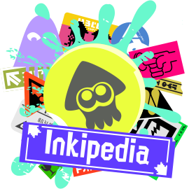
Mr. Hinoshin (talk) 11:09, 8 May 2022 (UTC)
Comments
- Support. A fantastic first submission to the contest! Heddy (talk) 11:32, 8 May 2022 (UTC)
- Support. This slaps. I love what you’ve done for the chaos theme, and although it’s a little bit busy in terms of colours when small, it’s also bold and original! I’m wondering if the main yellow circle and squid could be made a bit bigger to stand out more? Either way, loving it, great stuff. GloverMist (talk) 12:35, 8 May 2022 (UTC)
- Support. It's beautiful. On smaller sizes it's a bit condensed but overall I love the chaos and the athetetics. Shahar (talk) 12:54, 8 May 2022 (UTC)
- Support. This is amazing! I love how it matches the theme of Splatoon 3, while staying original and totally awesome. I can imagine it on the main page and I think it would look phenomenal! WoomyGirl85 (talk) 13:09, 8 May 2022 (UTC)
- Support. This is AMAZING. It really fits with Splatoon 3, and it would look really nice on the main page! SplatonGamer (talk) 13:34, 8 May 2022 (UTC)
- Support. Hey, I love this!!! One thing, I think the wordmark would look better with Splatoon's other font ninckmane (talk) 14:08, 8 May 2022 (UTC)Vinny
- I'm a bit worried that this wordmark looks like the actual Splatoon font. I would prefer to see something original and uniquely yours for the wordmark, rather than taken directly from a game. With small tweaks to the wordmark it could still have a Splatoon feel while being uniquely yours, just like the graffiti. I think the icon could be tweaked to look better at small size; it doesn't have to be the same as the full logo, you can do whatever you need to do to tweak the icon version of the art to be optimal for that size. Heddy (talk) 14:52, 8 May 2022 (UTC)
- Support. I love the chaotic energy this gives off and the overall style suits Splatoon 3 amazingly well! ShadowLugia250 (talk) 16:31, 8 May 2022 (UTC)
Proposal 2
DedSplat1369 (talk) 13:26, 8 May 2022 (UTC)
| Name | Icon | Wordmark | Logo | Notes | |||
|---|---|---|---|---|---|---|---|
| 1 | File:Inkipedia Logo Contest 2022 - DedSplat1369 - Icon Proposal 1.png | File:Inkipedia Logo Contest 2022 - DedSplat1369 - Icon Proposal 1.png | File:Inkipedia Logo Contest 2022 - DedSplat1369 - Logo Proposal 1.png | File:Inkipedia Logo Contest 2022 - DedSplat1369 - Logo Proposal 1.png | By the way, I didn't draw any of this. I put it together on a graphic designing app called Canva. I'm just an amateur graphic designer that thinks he's got skills. I don't want the prize, do whatever you want with it. There's really no theme here, but I did try to go with the yellow and blue theme of Splatoon 3. Also, I doubled the size for the files by accident instead of halved. Oops lol | ||
| 2 | File:Inkipedia Logo Contest 2022 - DedSplat1369 - Icon Proposal 1.png | File:Inkipedia Logo Contest 2022 - DedSplat1369 - Icon Proposal 1.png | File:Inkipedia Logo Contest 2022 - DedSplat1369 - Logo Proposal 3.png | File:Inkipedia Logo Contest 2022 - DedSplat1369 - Logo Proposal 3.png | New and improved version of my logo. I still can't draw, so I did't change any elements. I did darken the circle in the back for more contrast and put a background on the text for it to stand out more. By the way, please remember that I'm still an amateur in graphic designing and can't draw that well either. | ||
Comments
- Neutral. The icon looks decent despite your lack of confidence in your work. I noticed that many parts are green, so there isn't much contrast. Maybe you could tweak the colors? The thing that stands out the most is the eyes, strangely. You said that you didn't draw it, what does that mean? If it's not your own original art, could you use your graphic designer skills to replace any non-original parts with original work? I think originality is one of the most important things that will influence my vote. Overall, it's a clean image but it needs something to make it stand out. Heddy (talk) 14:44, 8 May 2022 (UTC)
- Neutral. Building on this, I think it looks colourful enough to stand up well as Splatoon-related, but I agree with Heddy in that the squid could stand out more from the background and the wordmark could stand out more from the squid. But aside from that, I like it! GloverMist (talk) 15:06, 8 May 2022 (UTC)
- Neutral. I do like how it's nice and clean, but as mentioned above, it feels like it doesn't entirely stand out. For me, while I do like the attempt to add some more contrast, it still doesn't entirely pop to me. It has potential to be great, but it doesn't feel attention-grabbing. Maybe, as mentioned prior, make the squid stand out a bit more? Keep on trying, it's got potential! ShadowLugia250 (talk) 16:28, 8 May 2022 (UTC)
- Neutral. I like the simplicity of it yet it looks a bit busy with the ink drops when the icon is small. The wordmark also looks cramped in small size which makes it a bit harder to read. Shahar (talk) 17:42, 8 May 2022 (UTC)
- Neutral. I think this has potential! Since you can't draw by yourself, I'd advise looking for better ink splats, specially from the second or 3rd game (there are tons of different graphics from nintendo!), and avoid using transparency for them, and also work on a better font for the wordmark ninckmane (talk) 17:45, 8 May 2022 (UTC)
Proposal 3
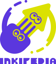
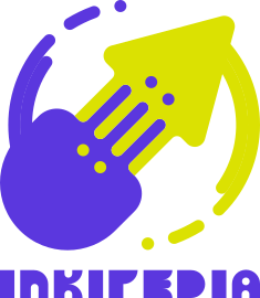
ninckmane (talk) 14:08, 8 May 2022 (UTC)
I think its worth pointing out that the logo kinda looks like a compass... wasn't intentional but I think its a fun detail considering its a wiki site lol
Comments
- Support. This isn't what I was expecting to see, in the best kind of way. Very clean, very stylish, simple in a way that pops! I appreciate the addition of an octo and like how it could be customisable too, though I definitely prefer the first version with the outlines around the eyes to make them look a bit more alive. My only thought is about the P the wordmark looking a bit like a lowercase R, but this is still very cool! GloverMist (talk) 15:06, 8 May 2022 (UTC)
- Support. A very refreshing unique simple and effective idea! The squid and octopus contrast makes for a fun representation of Inklings and Octolings, but as mentioned by GloverMist, the version with the outlines adds more life. It's really cool! — Preceding unsigned comment added by ShadowLugia250 (talk • contribs)
- Suport. I like this one. A modern look would definitely be a good logo to choose. The first one is the more preferable of the two, I think the second one does lack identity (to which you could fix in later version), but overall this one speaks to me. -- PanchamBro (talk • contributions) 17:00, 8 May 2022 (UTC)
- Suport. I like it a lot, reminds me of Yin and yang. I think the eyes are a bit low and the octo looks a bit more of a jellyfish than a monster of tentacles. I like the simplicity of it, makes it clean, clear and abstract which is very common lately. The wordmark I presume suppose to resemble language inscriptions seen in the game world. It may need to be adjusted to be easier to read, letters like D and O, P and R, E looks a bit too bold that in smaller sizes it resembles the filled-in D. Overall I think it's very beautiful. Shahar (talk) 17:42, 8 May 2022 (UTC)
Proposal 4
Octogrl66 (talk) 17:56, 8 May 2022 (UTC) Replace this text with a table displaying the submission
| Name | Icon | Wordmark | Logo | Notes | |||
|---|---|---|---|---|---|---|---|
| 1 | File:Inkipedia Logo Contest-Octogrl66-.png | File:Inkipedia Logo Contest 2022- Octogrl66- Logo 1.png | File:Inkipedia Logo Contest-Octogrl66-Wordmark Proposal | File:Inkipedia Logo Contest-Octogrl66-Wordmark Proposal | File:Inkipedia Logo Contest 2022- Octogrl66- Logo 1.png | File:Inkipedia Logo Contest 2022- Octogrl66- Logo 1.png | Still working on this page... there is an error |
Comments
Octogrl66 (talk) 17:48, 8 May 2022 (UTC)
Proposal 5
Optionally replace this text with anything you want to say about your proposal
Use 4 tildes (~~~~) to add your signature
Replace this text with a table displaying the submission
Comments
Proposal 6
Optionally replace this text with anything you want to say about your proposal
Use 4 tildes (~~~~) to add your signature
Replace this text with a table displaying the submission
Comments
Proposal 7
Optionally replace this text with anything you want to say about your proposal
Use 4 tildes (~~~~) to add your signature
Replace this text with a table displaying the submission
Comments
Proposal 8
Optionally replace this text with anything you want to say about your proposal
Use 4 tildes (~~~~) to add your signature
Replace this text with a table displaying the submission
Comments
Proposal 9
Optionally replace this text with anything you want to say about your proposal
Use 4 tildes (~~~~) to add your signature
Replace this text with a table displaying the submission
