Inkipedia:Logo Contest 2022/Round 1: Difference between revisions
AgentVeemo (talk | contribs) |
(my supports) |
||
| Line 88: | Line 88: | ||
* '''Support.''' REALLY fits the theme of Splatoon 3! And the fact that you accurately recreated the graffiti by hand is outrageous! Complete god-tier! {{User:P.J. GT/sig}} 01:15, 11 May 2022 (UTC) | * '''Support.''' REALLY fits the theme of Splatoon 3! And the fact that you accurately recreated the graffiti by hand is outrageous! Complete god-tier! {{User:P.J. GT/sig}} 01:15, 11 May 2022 (UTC) | ||
*'''Support''' This honestly looks amazing!!! It really does fit the chaos vibe! <big><span style="font-family:Splatoon 2">'''[[User:ChessMaster|<span style="color:gray">ChessMaster</span>]]''' '''[[User talk:ChessMaster|<span style="color:maroon">[TALK]</span>]]</span></big>''' 16:06, 14 May 2022 (UTC) | *'''Support''' This honestly looks amazing!!! It really does fit the chaos vibe! <big><span style="font-family:Splatoon 2">'''[[User:ChessMaster|<span style="color:gray">ChessMaster</span>]]''' '''[[User talk:ChessMaster|<span style="color:maroon">[TALK]</span>]]</span></big>''' 16:06, 14 May 2022 (UTC) | ||
* '''Support''' Fantastic, I can't believe almost everything is an original asset, looks as if it could be official artwork. I think in icon form, it seems a bit cluttered, perhaps the icons would look better with the centre squid part proportionally enlarged, covering up more of the graffiti. {{User:KA467/Sig}} 14:18, 16 May 2022 (UTC) | |||
== Proposal 2 == | == Proposal 2 == | ||
[[User:DedSplat1369|DedSplat1369]] ([[User talk:DedSplat1369|talk]]) 13:26, 8 May 2022 (UTC) | [[User:DedSplat1369|DedSplat1369]] ([[User talk:DedSplat1369|talk]]) 13:26, 8 May 2022 (UTC) | ||
| Line 164: | Line 166: | ||
* '''Support.''' I love the simplicity and the font, and it seems like it really fits in with Inkipedia and Splatoon as a whole! I wouldn't mind seeing it with different color set, but I love how unique it is while really going along with all the in-game logos and such. Great job! {{User:WoomyGirl85/Sig}} 12:37, 9 May 2022 (UTC) | * '''Support.''' I love the simplicity and the font, and it seems like it really fits in with Inkipedia and Splatoon as a whole! I wouldn't mind seeing it with different color set, but I love how unique it is while really going along with all the in-game logos and such. Great job! {{User:WoomyGirl85/Sig}} 12:37, 9 May 2022 (UTC) | ||
*'''Support''' Looks very cool and the simpleness is great! <big><span style="font-family:Splatoon 2">'''[[User:ChessMaster|<span style="color:gray">ChessMaster</span>]]''' '''[[User talk:ChessMaster|<span style="color:maroon">[TALK]</span>]]</span></big>''' 16:08, 14 May 2022 (UTC) | *'''Support''' Looks very cool and the simpleness is great! <big><span style="font-family:Splatoon 2">'''[[User:ChessMaster|<span style="color:gray">ChessMaster</span>]]''' '''[[User talk:ChessMaster|<span style="color:maroon">[TALK]</span>]]</span></big>''' 16:08, 14 May 2022 (UTC) | ||
* '''Support''' Really like this concept, very creative, though I have to wonder about being "futureproof-ness" if more playable species ever come down the line. I fear the Octo's purple overpowers the Squid's light green, and the green could be lost on light colour backgrounds, maybe an outline could be added to remedy this. {{User:KA467/Sig}} 14:18, 16 May 2022 (UTC) | |||
== Proposal 4 == | == Proposal 4 == | ||
Constructive Feedback please. I'm working on the Wordmark! Thank you for your patience! [[User:Oneeye|oneeye]] ([[User talk:Oneeye|talk]]) 21:56, 12 May 2022 (UTC) | Constructive Feedback please. I'm working on the Wordmark! Thank you for your patience! [[User:Oneeye|oneeye]] ([[User talk:Oneeye|talk]]) 21:56, 12 May 2022 (UTC) | ||
| Line 379: | Line 383: | ||
* '''Support.''' Very stylish and perfect for a wiki! It's almost like something you would see in-universe if Splatoon had a wiki about itself. I love the "reflection" of Inkling text for the wordmark. Regarding the wordmark image, whenever wikis use a wordmark alone, plenty of padding is added so it's best for the wordmark to not have padding built-in. So it would be best if you removed the empty space around the wordmark. [[User:Heddy|Heddy]] ([[User talk:Heddy|talk]]) 21:41, 12 May 2022 (UTC) | * '''Support.''' Very stylish and perfect for a wiki! It's almost like something you would see in-universe if Splatoon had a wiki about itself. I love the "reflection" of Inkling text for the wordmark. Regarding the wordmark image, whenever wikis use a wordmark alone, plenty of padding is added so it's best for the wordmark to not have padding built-in. So it would be best if you removed the empty space around the wordmark. [[User:Heddy|Heddy]] ([[User talk:Heddy|talk]]) 21:41, 12 May 2022 (UTC) | ||
* '''Support''' This is spectacular! I really like how there's a lot to see and it doesn't look boring, while not being super complex. I especially like the colors, as right now it is a lot of green, so some pink and turquoise would look new and fresh. {{User:WoomyGirl85/Sig}} 20:53, 15 May 2022 (UTC) | * '''Support''' This is spectacular! I really like how there's a lot to see and it doesn't look boring, while not being super complex. I especially like the colors, as right now it is a lot of green, so some pink and turquoise would look new and fresh. {{User:WoomyGirl85/Sig}} 20:53, 15 May 2022 (UTC) | ||
* '''Support''' My favourite entry so far, really does feel like an in-universe logo for a college or a library. I think that when super small, it may be difficult to make out. While I appreciate that both the Inkling and English languages are represented, I feel having both is a bit redundant. {{User:KA467/Sig}} 14:18, 16 May 2022 (UTC) | |||
== Proposal 9 == | == Proposal 9 == | ||
Revision as of 14:18, 16 May 2022
Round 1 is the feedback round. Everyone is encouraged to leave comments with helpful feedback under each proposal. You don't have to say whether you support or oppose a submission, as the most important thing is to provide specific feedback that the artist can use to craft the ultimate logo!
This period will last 4 weeks, during which you may continue submitting new works to receive feedback.
- Every artist who makes a submission will pass the round.
- Please submit as many logo proposals as you want.
- Add your new proposal at the bottom of this page and number it appropriately.
- For revised versions of a previous proposal, you may add them as a new variant under the same proposal (another row in the table).
- If you feel that the new version is very different, you can submit it as a new proposal with its own section.
- You can copy and paste the following text to display your images in a table. Just make sure the file names point to your images (use the "show preview" button!).
{| class="wikitable"
! Name
! colspan=2 | Icon
! colspan=2 | Wordmark
! colspan=2 | Logo
! Notes
|- style="text-align:center;"
! 1
| [[File:Inkipedia Logo Contest 2022 - YourUsername - Icon Proposal 1.png|50x50px]]
| [[File:Inkipedia Logo Contest 2022 - YourUsername - Icon Proposal 1.png|100x100px]]
| [[File:Inkipedia Logo Contest 2022 - YourUsername - Wordmark Proposal 1.png|x18px]]
| [[File:Inkipedia Logo Contest 2022 - YourUsername - Wordmark Proposal 1.png|x36px]]
| [[File:Inkipedia Logo Contest 2022 - YourUsername - Logo Proposal 1.png|135x135px]]
| [[File:Inkipedia Logo Contest 2022 - YourUsername - Logo Proposal 1.png|270x270px]]
| Optionally, any notes you want to write here.
|}
Proposal example
Write anything you want to say about your submission (use 4 tildes (~~~~) to add your signature)
| Name | Icon | Wordmark | Logo | Notes | |||
|---|---|---|---|---|---|---|---|
| 1 | Small icon | Large icon | Small wordmark | Large wordmark | Small logo | Large logo | Optionally, any notes you want to write here. |
| Another variant/version if there is one | Small icon | Large icon | Small wordmark | Large wordmark | Small logo | Large logo | Optionally, any notes you want to write about this variant. |
Comments
- Comments are closed because this is just an example.
Proposal 1
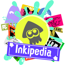
Mr. Hinoshin (talk) 11:09, 8 May 2022 (UTC)
Comments
- Support. A fantastic first submission to the contest! Heddy (talk) 11:32, 8 May 2022 (UTC)
- Support. This slaps. I love what you’ve done for the chaos theme, and although it’s a little bit busy in terms of colours when small, it’s also bold and original! I’m wondering if the main yellow circle and squid could be made a bit bigger to stand out more? Either way, loving it, great stuff. GloverMist (talk) 12:35, 8 May 2022 (UTC)
- Support. It's beautiful. On smaller sizes it's a bit condensed but overall I love the chaos and the athetetics. Shahar (talk) 12:54, 8 May 2022 (UTC)
- Support. This is amazing! I love how it matches the theme of Splatoon 3, while staying original and totally awesome. I can imagine it on the main page and I think it would look phenomenal! WoomyGirl85 (talk) 13:09, 8 May 2022 (UTC)
- Support. This is AMAZING. It really fits with Splatoon 3, and it would look really nice on the main page! SplatonGamer (talk) 13:34, 8 May 2022 (UTC)
- Support. Hey, I love this!!! One thing, I think the wordmark would look better with Splatoon's other font ninckmane (talk) 14:08, 8 May 2022 (UTC)Vinny
- I'm a bit worried that this wordmark looks like the actual Splatoon font. I would prefer to see something original and uniquely yours for the wordmark, rather than taken directly from a game. With small tweaks to the wordmark it could still have a Splatoon feel while being uniquely yours, just like the graffiti. I think the icon could be tweaked to look better at small size; it doesn't have to be the same as the full logo, you can do whatever you need to do to tweak the icon version of the art to be optimal for that size. Heddy (talk) 14:52, 8 May 2022 (UTC)
- Support. I love the chaotic energy this gives off and the overall style suits Splatoon 3 amazingly well! ShadowLugia250 (talk) 16:31, 8 May 2022 (UTC)
- Support. User:Eminence/Sig3 10:25, 9 May 2022 (UTC)
- Support. REALLY fits the theme of Splatoon 3! And the fact that you accurately recreated the graffiti by hand is outrageous! Complete god-tier! P.J. GT(talk)
 01:15, 11 May 2022 (UTC)
 - Support This honestly looks amazing!!! It really does fit the chaos vibe! ChessMaster [TALK] 16:06, 14 May 2022 (UTC)
- Support Fantastic, I can't believe almost everything is an original asset, looks as if it could be official artwork. I think in icon form, it seems a bit cluttered, perhaps the icons would look better with the centre squid part proportionally enlarged, covering up more of the graffiti. KA467 🗩 🖿 14:18, 16 May 2022 (UTC)
Proposal 2
DedSplat1369 (talk) 13:26, 8 May 2022 (UTC)
| Name | Icon | Wordmark | Logo | Notes | |||
|---|---|---|---|---|---|---|---|
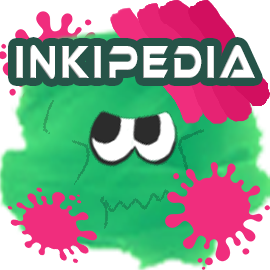
| 1 | File:Inkipedia Logo Contest 2022 - DedSplat1369 - Icon Proposal 1.png | File:Inkipedia Logo Contest 2022 - DedSplat1369 - Icon Proposal 1.png | File:Inkipedia Logo Contest 2022 - DedSplat1369 - Logo Proposal 1.png | File:Inkipedia Logo Contest 2022 - DedSplat1369 - Logo Proposal 1.png | By the way, I didn't draw any of this. I put it together on a graphic designing app called Canva. I'm just an amateur graphic designer that thinks he's got skills. I don't want the prize, do whatever you want with it. There's really no theme here, but I did try to go with the yellow and blue theme of Splatoon 3. Also, I doubled the size for the files by accident instead of halved. Oops lol | ||
| 2 | File:Inkipedia Logo Contest 2022 - DedSplat1369 - Icon Proposal 1.png | File:Inkipedia Logo Contest 2022 - DedSplat1369 - Icon Proposal 1.png | File:Inkipedia Logo Contest 2022 - DedSplat1369 - Logo Proposal 3.png | File:Inkipedia Logo Contest 2022 - DedSplat1369 - Logo Proposal 3.png | New and improved version of my logo. I still can't draw, so I did't change any elements. I did darken the circle in the back for more contrast and put a background on the text for it to stand out more. By the way, please remember that I'm still an amateur in graphic designing and can't draw that well either. | ||
Comments
- Neutral. The icon looks decent despite your lack of confidence in your work. I noticed that many parts are green, so there isn't much contrast. Maybe you could tweak the colors? The thing that stands out the most is the eyes, strangely. You said that you didn't draw it, what does that mean? If it's not your own original art, could you use your graphic designer skills to replace any non-original parts with original work? I think originality is one of the most important things that will influence my vote. Overall, it's a clean image but it needs something to make it stand out. Heddy (talk) 14:44, 8 May 2022 (UTC)
- Neutral. Building on this, I think it looks colourful enough to stand up well as Splatoon-related, but I agree with Heddy in that the squid could stand out more from the background and the wordmark could stand out more from the squid. But aside from that, I like it! GloverMist (talk) 15:06, 8 May 2022 (UTC)
- Neutral. I do like how it's nice and clean, but as mentioned above, it feels like it doesn't entirely stand out. For me, while I do like the attempt to add some more contrast, it still doesn't entirely pop to me. It has potential to be great, but it doesn't feel attention-grabbing. Maybe, as mentioned prior, make the squid stand out a bit more? Keep on trying, it's got potential! ShadowLugia250 (talk) 16:28, 8 May 2022 (UTC)
- Neutral. I like the simplicity of it yet it looks a bit busy with the ink drops when the icon is small. The wordmark also looks cramped in small size which makes it a bit harder to read. Shahar (talk) 17:42, 8 May 2022 (UTC)
- Neutral. I think this has potential! Since you can't draw by yourself, I'd advise looking for better ink splats, specially from the second or 3rd game (there are tons of different graphics from nintendo!), and avoid using transparency for them, and also work on a better font for the wordmark ninckmane (talk) 17:45, 8 May 2022 (UTC)
- Neutral. I think this is really cool, and it's a great starting point! I feel like the colors of the squid and ink together don't contrast enough, and the semi transparency bothers me a bit. I think with a few minor adjustments, this could look even better! WoomyGirl85 (talk) 12:37, 9 May 2022 (UTC)
Proposal 3
ninckmane (talk) 14:08, 8 May 2022 (UTC)
I think its worth pointing out that the logo kinda looks like a compass... wasn't intentional but I think its a fun detail considering its a wiki site lol
Comments
- Support. This isn't what I was expecting to see, in the best kind of way. Very clean, very stylish, simple in a way that pops! I appreciate the addition of an octo and like how it could be customisable too, though I definitely prefer the first version with the outlines around the eyes to make them look a bit more alive. My only thought is about the P the wordmark looking a bit like a lowercase R, but this is still very cool! GloverMist (talk) 15:06, 8 May 2022 (UTC)
- Support. A very refreshing unique simple and effective idea! The squid and octopus contrast makes for a fun representation of Inklings and Octolings, but as mentioned by GloverMist, the version with the outlines adds more life. It's really cool! ShadowLugia250 (talk) 16:34, 8 May 2022 (UTC)
- Support. I like this one. A modern look would definitely be a good logo to choose. The first one is the more preferable of the two, I think the second one does lack identity (to which you could fix in later version), but overall this one speaks to me. -- PanchamBro (talk • contributions) 17:00, 8 May 2022 (UTC)
- Support. I like it a lot, reminds me of Yin and yang. I think the eyes are a bit low and the octo looks a bit more of a jellyfish than a monster of tentacles. I like the simplicity of it, makes it clean, clear and abstract which is very common lately. The wordmark I presume suppose to resemble language inscriptions seen in the game world. It may need to be adjusted to be easier to read, letters like D and O, P and R, E looks a bit too bold that in smaller sizes it resembles the filled-in D. Overall I think it's very beautiful. Shahar (talk) 17:42, 8 May 2022 (UTC)
- Support. I really, really like where this is going. I actually like the second more than the first; maybe you will find a compromise or better solution if you feel it has lost personality. One complaint I have is the colors. I feel that these colors only represent Splatoon 3, but this wiki is about the entire Splatoon series and I feel the logo should reflect that or at least not be so obviously themed after one game. Plus I just don't like those colors in general, they sort of have a "nauseated" feel to them, lol 🤢🤮. Again, I really like this and hope I'm not the only one who doesn't like the colors. Heddy (talk) 21:45, 8 May 2022 (UTC)
- Support. Very simple and elegant. I really like the font on the wordmark. User:Eminence/Sig3 10:26, 9 May 2022 (UTC)
- Support. I love the simplicity and the font, and it seems like it really fits in with Inkipedia and Splatoon as a whole! I wouldn't mind seeing it with different color set, but I love how unique it is while really going along with all the in-game logos and such. Great job! WoomyGirl85 (talk) 12:37, 9 May 2022 (UTC)
- Support Looks very cool and the simpleness is great! ChessMaster [TALK] 16:08, 14 May 2022 (UTC)
- Support Really like this concept, very creative, though I have to wonder about being "futureproof-ness" if more playable species ever come down the line. I fear the Octo's purple overpowers the Squid's light green, and the green could be lost on light colour backgrounds, maybe an outline could be added to remedy this. KA467 🗩 🖿 14:18, 16 May 2022 (UTC)
Proposal 4
Constructive Feedback please. I'm working on the Wordmark! Thank you for your patience! oneeye (talk) 21:56, 12 May 2022 (UTC)
Comments
- Neutral. I like this idea! I think it's creative and represents the game well. But you are missing half of the assets asked for in the submission guidelines. Regarding the drawing, I think making it simpler is the way to go, considering that the idea is to have it vectorized for use on the site. You have a good idea, but it still needs the wordmark to tie it all together! There are a lot of ways to go for making it, maybe basing it off a script in the game, or using a font that you think represents the logo. ninckmane (talk) 21:05, 9 May 2022 (UTC)
- I do agree that it may benefit from less shading and more simplicity, as icons need to be simple to look good at small sizes. As I said when you posted on Discord, I love it. Looking forward to your progress on the wordmark and logo as well! Heddy (talk) 22:03, 9 May 2022 (UTC)
- Now that I see the first and second jelly icon, I think the second one looks cuter! Though I am unsure about going full pixel art, it could work. Just my opinion. It might help you decide what to do if you go ahead and draft wordmark and logo and collect feedback on those as well. (Also - Don't worry about vector graphics, just do what you think will make the most amazing logo!) Heddy (talk) 09:21, 10 May 2022 (UTC)
- I think it's beautiful. The Question mark in the back looks like the Jellyfish is holding a seaweed. I like the pixel art, I'd love to see more variants along with the wordmark and logo. Shahar (talk) 10:29, 10 May 2022 (UTC)
I think it looks really cute! I like how it's very different than what we have right now, and it fits in well with the wiki-ness. Once you make the wordmark, I think this would amazing as the logo!WoomyGirl85 (talk) 12:55, 11 May 2022 (UTC)- Support. I love this idea! It’s fun and original to have a jellyfish on the logo and it’s drawn excellently. My only minor thoughts are, as others said, that it would be hard to make out at small sizes, and that some of the logo’s letters are a bit difficult too, like the first "I" looking lowercase. Maybe it could benefit from a larger border around the word? Either way, this is excellent stuff. GloverMist (talk) 21:16, 11 May 2022 (UTC)
- Support. This is probably my favorite so far. However, as much as I love the jelly, I don't feel the same way about the wordmark. Currently, the wordmark appears to be "ancient text" styled like the sunken scrolls, and some may say that fits because the jelly is holding a scrollbook. However, I personally believe that a more "scholarly" or "sophisticated" style wordmark may be a better fit for this logo. Something where newcomers would be able to instantly see that it says "Inkipedia" without having to pause to decipher it. Heddy (talk) 22:08, 11 May 2022 (UTC)
- I think there isn't enough contrast in the wordmark between the text and the background. Shahar (talk) 22:14, 11 May 2022 (UTC)
- I really liked to follow the rapid evolution of your logo, and congratulate you on learning to vectorize specifically for this project! I think the logo looks pretty nice, though I agree with Heddy and Shahar, it should be more readable.. currently I read it as Ink!ped!a, though I like the implementation of inkling script. ninckmane (talk) 23:15, 11 May 2022 (UTC)
- Support. Definitely a good contender as a good logo for Inkipedia. I agree that that workmark could use some work to be more readable.
The icon itself doesn't look good when zoomed out either, as shown here. I recommend changing the icon to be a little more simple. Like maybe the Jellyfish head only.-- PanchamBro (talk • contributions) 00:47, 12 May 2022 (UTC)
- What am I talking about lol? I'm not even sure if this is going to be a favicon anyways. -- PanchamBro (talk • contributions) 00:49, 12 May 2022 (UTC)
- @PanchamBro You're right, the icon isn't meant to be used as a favicon, though the icons certainly could be adapted into a favicon. The icon is meant to be used at sizes near 50x50 and higher, like on the desktop version of the Vector 2022 skin for example, where it's used right next to the wordmark (you can also see on that page, how different their favicon and normal icon are). I think that any favicon changes should be handled after this contest is over, because 16x16 favicons are often very different from the logo or larger icons. Heddy (talk) 23:16, 12 May 2022 (UTC)
- Support. This looks great! I like the wordmark, and the overall idea is awesome!WoomyGirl85 (talk) 20:53, 15 May 2022 (UTC)
Proposal 5
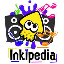
Honestly, I made this because I like the Splatoon series and was bored. I'm just a beginner graphic designer. K Kit (talk) 23:53, 9 May 2022 (UTC)
Comments
- Weak support. For the wordmark, there appears to be some empty space on the borders; it would be best to crop that out so that the wordmark doesn't have any padding (trust me, there is plenty of padding added whenever wikis use the wordmark, so the wordmark itself should generally not have padding). The squid seems to clash with the rest of the art style; could you tweak that somehow, maybe draw the squid in your own style if you can? I wonder, could this somehow be made more dance-y? I'm imagining a squid dancing and shaking maracas with tentacles, lol, not sure how that would work in a logo so just ignore me I guess. Your logo has potential! Have fun with it, and you could do something amazing! Heddy (talk) 06:10, 10 May 2022 (UTC)
- Weak support. I think it's very cool. The speakers with the music nodes make it look like a groovy logo. I think it would be more fitting if our site was solely a media service. Shahar (talk) 10:29, 10 May 2022 (UTC)
- Weak support. I like it, however I do agree with what Heddy said. User:Eminence/Sig3 10:48, 10 May 2022 (UTC)
- Weak support. I think this is awesome, and I totally agree that music is a big part of the series. However, what Shahar said about it being good for a music site is true. This is really fantastic though, and I like the idea a lot! WoomyGirl85 (talk) 12:55, 11 May 2022 (UTC)
- Neutral. I agree with the others’ comments about the music theme being fitting for the games but maybe less for the site. However, the composition and colours work well, even if the wordmark is a little blurry around the edges? I prefer the white-squid version! GloverMist (talk) 21:16, 11 May 2022 (UTC)
Proposal 6
I had fun working on it. I wanted to make the logo look like a squid that is hiding in ink on the wall with brush movements of ink in the background. Don't crucify me please only positive and constructive comments. Shahar (talk) 09:51, 10 May 2022 (UTC)
13 May 2022 Update! Added contrast and ink splatters to the logo to make it more vibrant and alive. I also stretched the wordmark so it would be easier to read in small size. A side note that can be made is the incomplete squid that could reflect the wiki that is never complete and is getting continuously improvements. Shahar (talk) 14:56, 13 May 2022 (UTC)
Comments
- Weak Support. I like the logo, my only concern with the wordmark is that the colors look very similar to the already existing wordmark. I would prefer if the border on the wordmark wasn't as rounded and the color was changed, maybe yellow? Other than that, good logo! User:Eminence/Sig3 10:45, 10 May 2022 (UTC)
Weak support. I agree with what Eminence said about the colors, as they also make it a bit hard to read when it's small. Other than that, this looks excellent, and it's a great idea! WoomyGirl85 (talk) 12:55, 11 May 2022 (UTC)- Support. Aside from the slightly generic-looking font, I really like the simplicity of this one! It fits the style of the cover of Splatune, for example. Sweet idea. GloverMist (talk) 21:16, 11 May 2022 (UTC)
- Support. A good idea, well executed, and the wordmark has a futuristic look. It may benefit from changes to add contrast. Heddy (talk) 22:16, 11 May 2022 (UTC)
- Support The hiding squid is very unique and the font makes it look very futuristic! The second version adds more to the look of it. Very unique! ChessMaster [TALK] 16:06, 14 May 2022 (UTC)
- Support. The new colors look even better! This is terrific! (Btw that font is really cool :)) WoomyGirl85 (talk) 20:53, 15 May 2022 (UTC)
Proposal 7
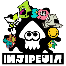
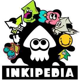
This is my first time uploading anything here so I'm sorry if I screw up. Anyways, I decided to add graffiti and stickers from all 3 games and the Octo Expansion, the wordmark is in the font "Inkling" that was made by u/frozenpandaman on Reddit (the font can only be used with credit so if that doesn't work for a logo, I can change it to a regular font that isn't Splatoon-specific). — Preceding unsigned comment added by MK Squid (talk • contribs) 10:17, 10 May 2022 (UTC)
| Name | Icon | Wordmark | Logo | Notes | |||
|---|---|---|---|---|---|---|---|
| 1 | 
|
| |||||
| 2 | File:Inkipedia Logo Contest 2022 - YourUsername - Icon Proposal 2.png | File:Inkipedia Logo Contest 2022 - YourUsername - Icon Proposal 2.png | 
|
|
I changed the font to the Splatoon 1 font that was ripped from the game itself. As for the icon, I can see why it may look boring, however, I don't want to add more elements to it because an icon has to be clearly recognizable at an extremely small size and that doesn't work if there's too much going on, so it has to be very simple. What I might try to do in the 3rd version is make the squid green and see how that looks, maybe I'll also try tilting the squid to the side. | ||
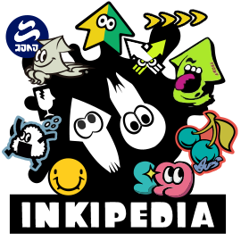
| 2 | 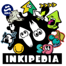
|
|
Changed the squid icon in the middle for a squid and an octopus (original is from the japanese splatoon 2 website, redrawn in Illustrator) | ||||
Comments
- Support. This looks really cool! The only thing that may need a change to me is the font may seem a little hard to read to people new to the Splatoon and the wiki. This looks really good, and I hope you get far in the contest. K Kit (talk) 15:44, 10 May 2022 (UTC)
This is great, and I really like the graffiti! However, as cool as the font is, the crediting might be a problem. You may want to contact the creator if possible, since if it becomes the logo we obviously don't want to have a problem with it. WoomyGirl85 (talk) 12:55, 11 May 2022 (UTC)- Weak support. Although I like the graffiti and the bold monochrome in the middle, I agree with the comments about the font - partly for crediting, but also for readability, as any newcomers would have almost no idea what it’s supposed to say, as it reads “Injipeuia”. GloverMist (talk) 21:16, 11 May 2022 (UTC)
- Weak support. I like the idea of the icon having less elements than the logo itself which can work well in small sizes. Unfortunately I think the black colors are a bit monotone which contradicts the game aspect being colorful. Shahar (talk) 22:14, 11 May 2022 (UTC)
- Neutral. This did not evoke much emotion in me, so I'm wondering if you could take your concept and push it further somehow? Perhaps the squid or the wordmark could be re-drawn in a graffiti or sticker style, whatever you feel like you could do to make it cooler or more cohesive! Overall, no real complaints other than wanting it to be pushed further into a particular style or theme. Clean logo, great work! Heddy (talk) 02:20, 13 May 2022 (UTC)
- Weak Support This is pretty cool, and I really like the graffiti part, the only problem is that besides that, it is a bit meh. Which isn't necessarily bad, as simplicity is important. Like Heddy said, I think with lil more pizazz it could be even cooler. WoomyGirl85 (talk) 20:53, 15 May 2022 (UTC)
Proposal 8
Originally had it as the Splatoon 3 colors, but I think it just looks better with this palette. I'm using a restrictive color palette to go for the vibe of something you'd see in-game. AQUA (talk) 00:23, 12 May 2022 (UTC)
Comments
- I really, really like this! I just feel that the logo version feels a little scattered with the three elements on top, as well as not having a transparent background. I think it would be better if you centered the globe icon on the logo and used the other elements as additives. Great use of colors and very modern though, congrats! ninckmane (talk) 00:36, 12 May 2022 (UTC)
- Support. Really like this proposal so far. My only complaint is how the logo is presented. Maybe if the pink background was in a shape instead of being the main background for the logo, I think it would look great! -- PanchamBro (talk • contributions) 00:47, 12 May 2022 (UTC)
- Support. I was a bit undecided towards the first version, but I adore the second version. That is exactly what I think would work perfectly for the site! It’s clean, fresh, bold, and original. The pink outline on the icon helps it, while the reflection of the Inkling text under the wordmark is awesome. Great stuff! GloverMist (talk) 06:44, 12 May 2022 (UTC)
- Support. Very stylish and perfect for a wiki! It's almost like something you would see in-universe if Splatoon had a wiki about itself. I love the "reflection" of Inkling text for the wordmark. Regarding the wordmark image, whenever wikis use a wordmark alone, plenty of padding is added so it's best for the wordmark to not have padding built-in. So it would be best if you removed the empty space around the wordmark. Heddy (talk) 21:41, 12 May 2022 (UTC)
- Support This is spectacular! I really like how there's a lot to see and it doesn't look boring, while not being super complex. I especially like the colors, as right now it is a lot of green, so some pink and turquoise would look new and fresh. WoomyGirl85 (talk) 20:53, 15 May 2022 (UTC)
- Support My favourite entry so far, really does feel like an in-universe logo for a college or a library. I think that when super small, it may be difficult to make out. While I appreciate that both the Inkling and English languages are represented, I feel having both is a bit redundant. KA467 🗩 🖿 14:18, 16 May 2022 (UTC)
Proposal 9
ChessMaster [TALK] 15:57, 14 May 2022 (UTC)
Comments
- Weak oppose. While the artstyle does sort of remind me of those old-school cartoons from the 90s, they could certainly use improvements. I think in general the face could use some work. I don't want to go too long, but I can share with you an example of reference lines being used to create faces and whatnot. Also, while I like the way the workmark is drawn, having a green-and-yellow background beneath is not appealing. -- PanchamBro (talk • contributions) 01:17, 15 May 2022 (UTC)
Proposal 10
Optionally replace this text with anything you want to say about your proposal
Use 4 tildes (~~~~) to add your signature
| Name | Icon | Wordmark | Logo | Notes | |||
|---|---|---|---|---|---|---|---|
| 1 | File:Inkipedia Logo Contest 2022 - AgentVeemo - Wordmark Proposal 1.png | File:Inkipedia Logo Contest 2022 - AgentVeemo - Wordmark Proposal 1.png | 
|

|
Optionally, any notes you want to write here. | ||
Comments
Proposal 11
Optionally replace this text with anything you want to say about your proposal
Use 4 tildes (~~~~) to add your signature
Replace this text with a table displaying the submission
Comments
Proposal 12
Optionally replace this text with anything you want to say about your proposal
Use 4 tildes (~~~~) to add your signature
Replace this text with a table displaying the submission
